Last week, I had the pleasure of hearing Joa Studholme, Farrow & Ball’s color curator, speak at the Boston Design Center—and it was the kind of talk that leaves your designer brain buzzing.

Joa shared her process of developing new colors by blending instinct, history, and real-life observations before discussing the new 2025 palette. Excitingly, she curated three colors from Farrow & Ball’s rich archive, bringing forward colors that speak to how we want to feel in our homes now: grounded, warm, and connected to nature. This is paired with six brand-new colors. Expect muddier greens, chalky reds, and soft neutrals that evolve beautifully with changing light.

Joa’s insight reminded me that color is less about what's “in” and more about what creates comfort, contrast, and character in a space. In her presentation, we saw the many inventive and insightful ways color can be used to dictate mood in a space. Whether it is in a small space inside a cupboard or color washing an entire room, paint is one of the easiest ways to impact the mood and tone of a space.
Duster is an aged golden yellow inspired by a cleaning cloth Joa recalled from her youth—warm and nostalgic, it would add a cozy glow to a reading nook, mudroom, or the inside of a pantry cupboard.
Marmelo, a rich marmalade tone, draws from the warmth of pantry shelves lined with jams and pickled goods. It would be striking in a kitchen or as an accent in a dining area.
Scallop is a soft, romantic take on the popular Dead Salmon, offering a quieter warmth that could work beautifully in a bedroom or layered living space.
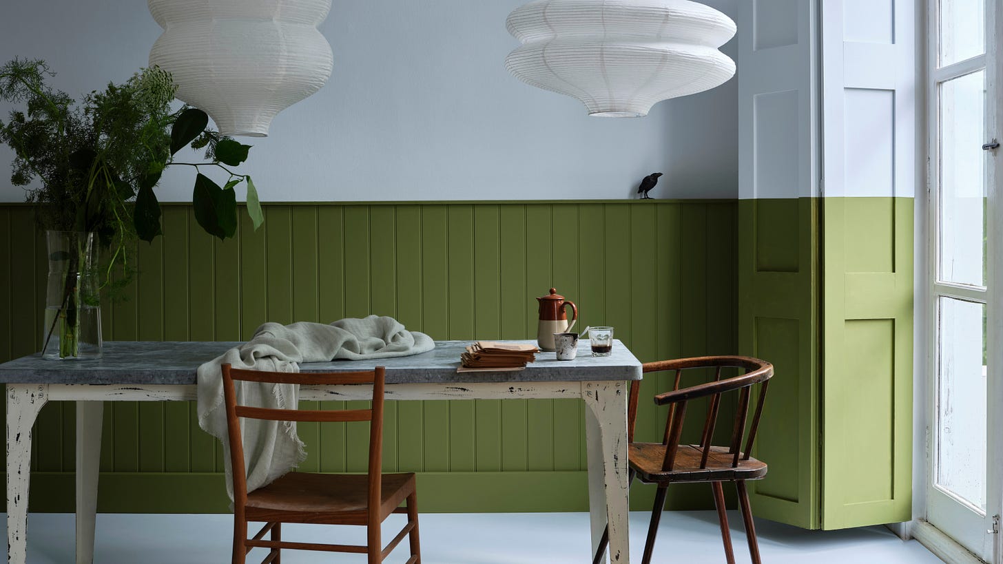
Dibber, a muddy, earthy green named after the gardener’s tool, brings a grounded feel perfect for a home office, entryway, or cabinetry in a utility space.
Reduced Green has just a whisper of green, so faint it almost reads as brown, making it ideal for layered interiors that lean subtle and tonal, such as hallways or transitional spaces.
Sizing, the palest in the new drop, is a transparent, starch-inspired blue that would sing in a bathroom, laundry room, or anywhere you want a fresh, airy wash of color.
Naperon, a warm, clay-like neutral, nods to the aprons of everyday life. This shade brings a natural softness that works well in kitchens, dining spaces, or grounding an all-over wall treatment.
Kakelugn is a vibrant yet clean blue, a more refined take on Light Blue, named after Swedish tiled stoves. It would bring charm to a guest room, powder room, or modern coastal palette.
Douter, a green interpretation of the beloved Inchyra Blue, evokes tarnished brass and soot—ideal for a moody study, library, or dramatic built-ins.
Etruscan Red, revived from the Archives, is a rich but muted alternative to Preference Red. Use it in a dining room or dramatic powder room for timeless elegance with depth.
Broccoli Brown, also from the Archives, is a warm, weathered brown reminiscent of aged wood or stone floors—perfect for millwork, flooring, or even a tonal living space.
Sap Green rounds out the palette with a lively, olive-toned green pulled from the Archives. It would bring playful vibrance to cabinetry, a sunroom, or even an unexpected front door.
Be sure to check out all of the New Colours on the Farrow & Ball website, and let us know your favorites.
Until next time,
The Slate Team


