


Color Theory: Farrow & Ball French Grey

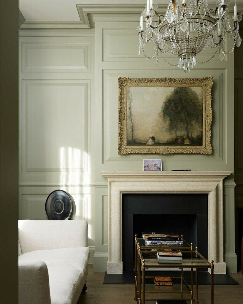
When it comes to timeless, versatile shades, French Grey by Farrow & Ball stands out as an enduring favorite. This soft, muted color is more than just a simple neutral—it’s a beautiful balance of green, blue, and gray tones, creating a subtle yet sophisticated backdrop that can transform any space.
Let’s dive into why French Grey works so well and how it ties into the principles of color theory.
A Chameleon Shade: The Power of Undertones
At first glance, French Grey might appear as a muted, traditional gray, but it reveals its complexity when examined closely. Like many Farrow & Ball shades, it shifts dramatically depending on the light. In spaces flooded with natural light, the subtle green undertones are enhanced, offering a fresh, almost coastal feel. In lower light, the blue-gray base deepens, creating a more intimate, cozy atmosphere.
This is a classic example of how undertones impact the mood and versatility of a color. By straddling multiple tones, French Grey can complement a variety of palettes, making it a perfect choice for both modern and traditional interiors.
Creating Harmony with French Grey
In color theory, balance is crucial. French Grey is an ideal neutral because it brings together cool and warm tones, making it incredibly adaptable. It pairs seamlessly with both warmer hues like soft creams and taupes, as well as cooler shades such as crisp whites and deep blues. This harmony allows it to ground a space without overwhelming it, acting as a calming canvas for more vibrant accents.
When designing a space, this balance makes French Grey a go-to for those looking to create a serene, sophisticated environment. It’s understated yet full of depth, a color that quietly enhances a room rather than dominating it.
Emotional Impact: Calm and Timeless
Colors have the power to influence our emotions, and French Grey is no exception. Its soothing, muted quality brings a sense of calm and timelessness to any room. Unlike bolder colors that can evoke strong, immediate reactions, French Grey creates an ambiance of tranquility and elegance, making it ideal for spaces where relaxation is key—think bedrooms, living rooms, or even home offices.
In color psychology, shades of gray are often associated with neutrality and balance, while hints of green and blue promote calm, clarity, and a connection to nature. This makes French Grey an excellent choice for those looking to create a peaceful retreat within their home.
How to Use French Grey in Your Home
Because of its adaptability, French Grey can work in a variety of spaces and design styles. Here are a few ideas for incorporating this versatile shade into your home:
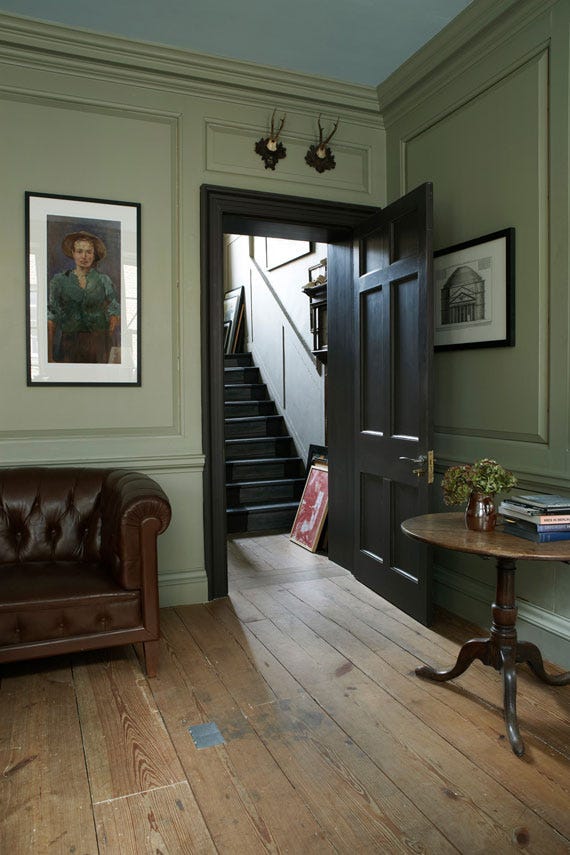
Living Rooms: Use French Grey on the walls to create a soft, inviting atmosphere. Pair it with natural materials like wood and stone to enhance its earthy undertones, or with metallic accents for a more modern edge.
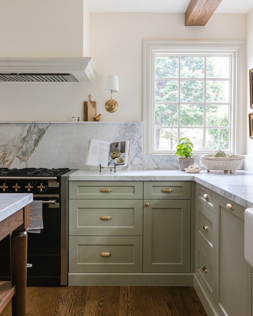
Kitchens: In a kitchen, French Grey brings a clean, fresh feel without the starkness of white. Consider using it on cabinetry or as a complementary color for an island, paired with marble countertops or a contrasting backsplash.
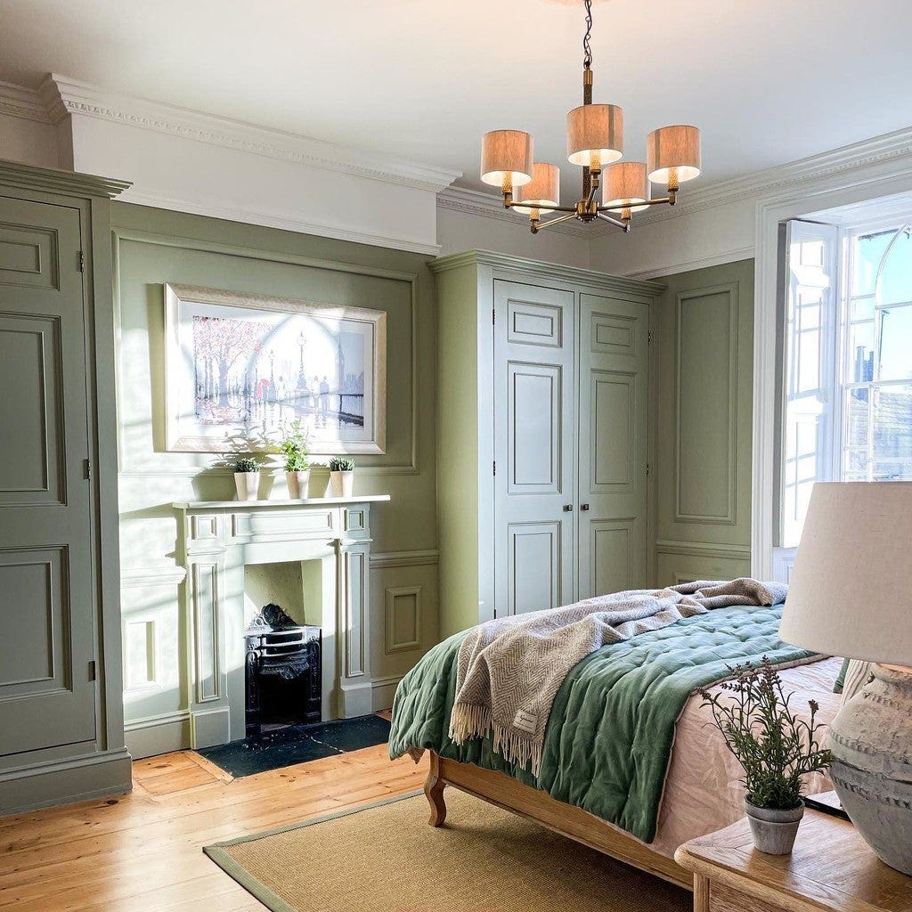
Bedrooms: This soothing shade is perfect for creating a restful bedroom retreat. Pair it with crisp white linens and muted pastels for a serene, airy feel, or go bold with deep navy accents for a more dramatic, moody look.
Exteriors: Don’t overlook the potential of French Grey for outdoor spaces. It works beautifully on front doors, shutters, or even exterior siding, adding a subtle, elegant touch to the curb appeal of your home.
Final Thoughts: Why French Grey Is a Designer Favorite
Farrow & Ball’s French Grey is a masterclass in balance and sophistication. Its nuanced blend of green, blue, and gray makes it a versatile, timeless choice for a wide range of design styles and spaces. Whether you’re looking to create a calm, soothing bedroom or a fresh, elegant living area, this color provides the perfect backdrop without overpowering the room.
French Grey reminds us that the power of color lies not just in its boldness, but in its subtlety. It’s a color that enhances rather than dictates, bringing harmony, elegance, and a sense of tranquility to any space.
Until next time,
The Slate Team